Why Are Logos Important For Businesses?
Why are logos important for businesses?
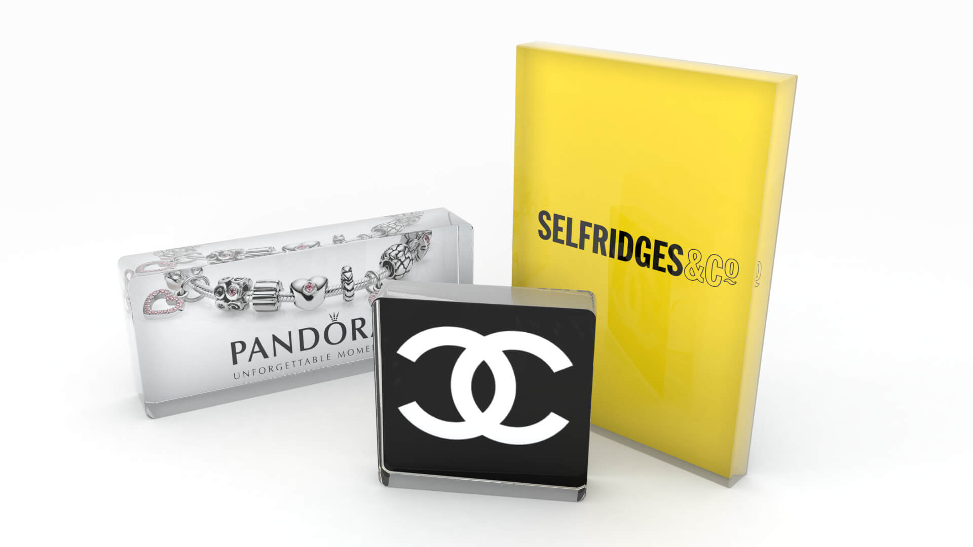
A good brand logo creates instant brand recognition and visual consistency, conveying trustworthiness and professionalism. Your logo forms your brand identity and sets you apart from your competitors.
How do logos work?
Consumers can interpret images much faster than text, and this makes logos a great way to reinforce faster brand recognition.
Logo use forms a strong part of corporate visual identity and supports company reputation [1].
‘The logo acts as a badge of identification, as a mark of quality and as a way to increase a
company's reputation.’
- N. Hynes [2]
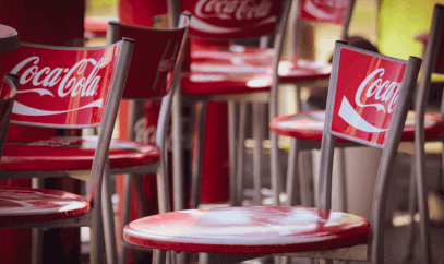
Logo colours can evoke emotions, making a brand more memorable. For example, McDonalds' red and yellow "M" logo is recognisable and can make people feel hungry.
One of the basic principles of logo design is that a good logo should be unique, uncomplicated and memorable. Done correctly, your logo can identify your brand and build your image, communicating information and reflecting core values [3].
What to consider when designing a brand logo:
- Who is your market and what do they value?
- What colour schemes and styles are popular in your sector?
- What is your unique selling point?
- Will your logo work in different formats and on different platforms?
The 7 types of logo
1. Abstract
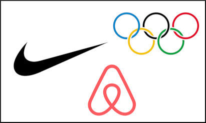
Abstract logos provide an opportunity to create a unique symbol which conveys brand messaging.
Consider the Nike "swoosh" which conveys movement and upward motion, or the Olympic symbol which represents five united continents.
2. Mascot
Mascot logos personify the brand. Customers respond warmly to characters who provide a fun or familiar face.
Mascot logos are a popular choice for food companies - think Colonel Sanders of the KFC logo, or Aunt Bessie in the UK.
3. Combination mark
A combination mark is a popular choice for many companies, allowing them to pair an identifiable image with their brand name.
Using a combination mark may be a good choice for less-established brands who wish to get their name known.
4. Lettermark
A lettermark (aka a monogram) uses company initials to create a typographic logo. This is even more memorable if the initials create an acronym. For example, everyone remembers the French Connection UK acronym.
5. Emblem
Emblems contain text inside of a symbol. Similar to a national emblem or family coat of arms, they give a classic and traditional appearance, suggesting longevity.
Emblems can, however, be difficult to scale down.
6. Wordmark
A wordmark, aka a logotype, foregrounds the company name using typography making a strong connection between name and visual identity.
Pick or create a font that suits your industry and identity.
7. Pictorial mark
Pictorial marks, also known as brand marks, are a great choice for companies with brand names that suggest a specific image.
Companies such as Apple, Dove and Shell capitalise on their names by using simple images for their logos. This technique is a no-brainer for marketers.
Pictorial marks convey brand information incredibly quickly with their simple designs, and will stick out in the memory of a consumer. Many pictorial marks have the added benefit of being easy to add to web pages and social media as a button.
Logos don't always need to be complex and expensive. In fact, the original Twitter logo was first bought as an iStock photo for just $15! The bird design has undergone some redesigns since then, but the basic bird shape has stuck as their lasting brand mark. It's used on everything from web pages to printed material, to company logo signs.
Logo display ideas for point of sale marketing
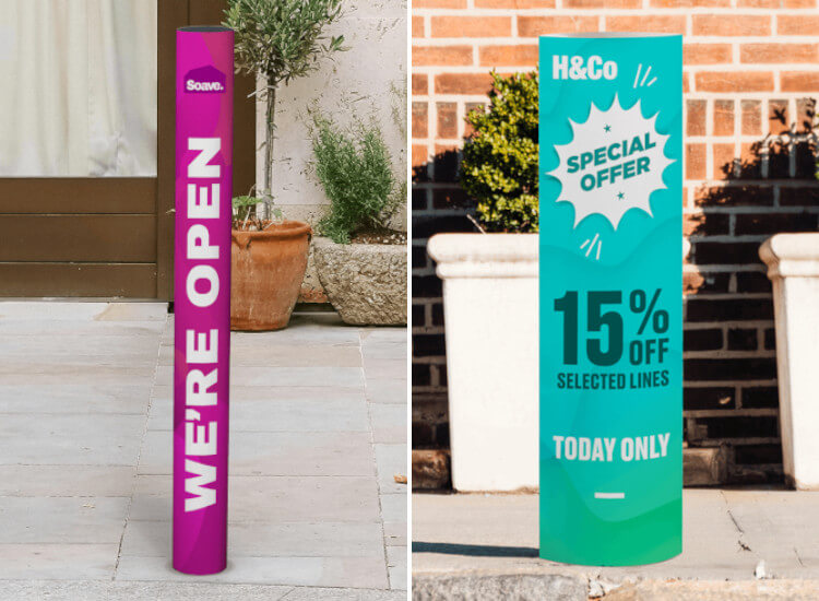
Posters
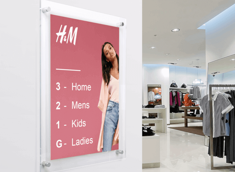
Display customised posters in stores, windows and pavement signs. Promote products and services with printed posters.
Banners and barriers
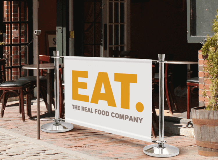
A branded cafe banner or barrier allows for both patrons and passersby to become acquainted with your logo and branding.
Leaflet holders
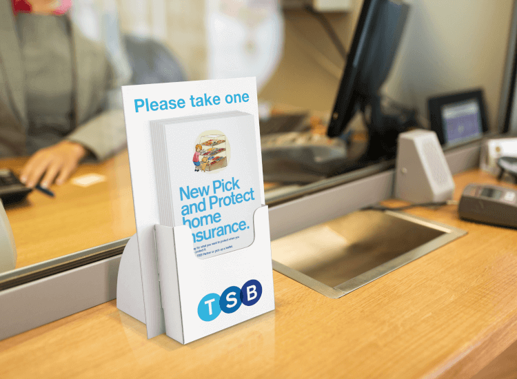
Use branded leaflet dispensers at receptions and checkouts to get your logo and literature seen simultaneously.
Promotional stands
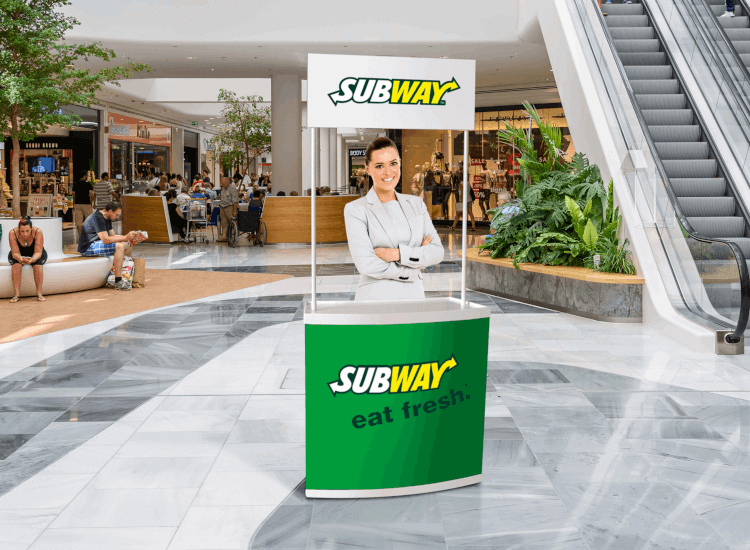
Make your new company or product twice as memorable by offering free samples at a branded stand.
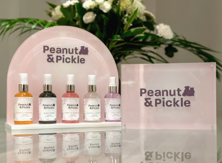
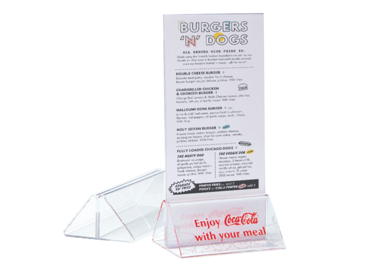
Frames and sign holders
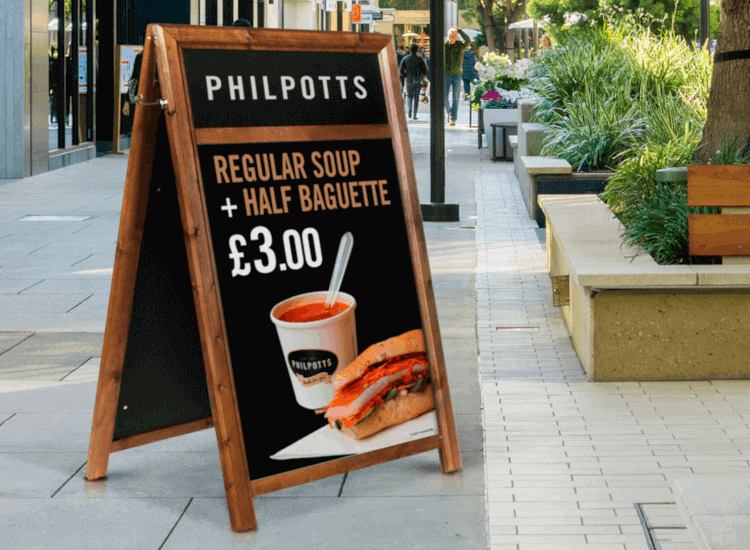
Reinforce your branding by displaying logos on your A board headers, poster frames, leaflet holders and sign holders.
Banners and flags
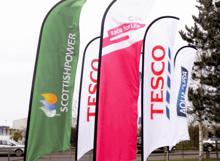
Banners and flags are ideal for outdoor use, such as on forecourts, as they allow branding to be spotted from afar.
'The corporate identity of a firm should reflect its values, mission statement, strategy and characteristics, and the logo design and colour can be a vital aid in this.' - N. Hynes
Summary
Remember that simplicity is strength when it comes to logo design. Avoid complicated logos as they're less attractive, and more difficult to remember.
Different types of logo send different messages about your business, so consider the key messages you need to convey. Key messages should suit your industry type and meet the needs of your target market.
Don't overlook opportunities to incorporate logos and branding at your point of sale.
Every aspect of your POS can reinforce brand identity and increase brand awareness. From colour schemes and display materials, to customer service and even employee uniforms.
Consider investing in bespoke manufacturing and branding to enhance your corporate visual identity throughout your business.
Discover how we can help you to create eye-catching and unique marketing materials with custom logo printing for your point of sale.
References
1. Van den Bosch, de Jong and Elving, ‘How corporate visual identity supports reputation’, Corporate Communications: An International Journal, Vol. 10 No. 2, 2005, pp. 108-116.
2. Hynes, Niki, ‘Colour and meaning in corporate logos: An empirical study’, Brand Management, Vol. 16, 8 (2009), pp. 545-555.
3. Van Riel, Van den Ban, ‘The added value of corporate logos - An empirical study’, European Journal of Marketing, Vol. 35, Issue 3/4 (2001), pp. 428-440.


