


How Banks Can Improve Accessibility Through Better In-Branch Signage

Accessibility goes beyond compliance
Accessibility in UK banking is often framed around meeting regulations, but for customers, it’s about something more personal: feeling confident and independent in the space.
Bank branches serve people with a wide range of needs, from visual impairments and mobility challenges to anxiety or cognitive overload. Clear visual communication plays a vital role in making these spaces welcoming and usable for everyone.
Why signage matters for inclusive experiences
Good signage reduces reliance on verbal communcation. It allows customers to understand where to go, what services are available and what to expect, without having to ask for help.
This sense of independence is particularly important in financial environments, where some customers may already feel vulnerable or unsure.
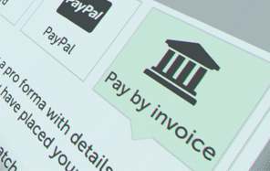
Overhead signage and floorstanding sign holders are useful for signposting where your customers need to go - use a combination of both to ensure these signs are visible for everyone.
Where many branches fall short
Accessibility issues often come down to presentation rather than intent. Small text, poor colour contrast, cluttered noticeboards or inconsistent placement can make even essential information difficult to access.
When customers struggle to read or locate information, frustration increases and staff are interrupted more frequently. This impacts both experience and efficiency.
It's important to consider a wide range of user needs when designing your layout and signage. Don't just focus on one issue such as visual impairment. Check out this blog on dos and don'ts on designing for accessibility from GOV.UK. It highlights various accessibility needs you may wish to take into account.
-

Freestanding Leaflet Poster Display
FD61 In stockFrom: £162.01 ex. VATView -


A1 Information Board
FD65 In stockWas: £106.59 From: £78.00 ex. VATView -

Aluminium Poster Hanger
PSS1 In stockFrom: £3.66 ex. VATView -


Counter Standing Acrylic Block Sign Holder
ADF In stockFrom: £9.96 ex. VATView
Designing bank signage that works for more people
Improving accessibility doesn’t require a complete redesign of a bank branch. Often, it comes down to thoughtful decisions about how information is presented and where it’s placed. Signage that works well for a wider range of people tends to share a few common characteristics.
When designing or updating in-branch signage, banks should consider:
- Clear, legible typography
Text should be large enough to read comfortably from a reasonable distance, using simple fonts, universally-recognised symbols, and avoiding overly condensed or decorative styles. - Strong colour contrast
High contrast between text and background makes information easier to read for customers with visual impairments and in varied lighting conditions.
- Logical placement at accessible heights
Signage and leaflet holders should be positioned at eye level where possible, ensuring information is reachable for wheelchair users and those who may struggle to bend or stretch. - Uncluttered presentation
Too much information displayed together can be overwhelming. Grouping content clearly and limiting each display to a single purpose helps customers process information more easily.
- Consistent layouts and formats
Repeating visual patterns across the branch (such as similar poster sizes or display styles) helps customers recognise and understand information more quickly.
These small but deliberate choices make signage more inclusive, while also improving clarity for every customer who walks through the branch.
Leaflet displays that support independent browsing
Leaflet holders can significantly improve accessibility when they’re thoughtfully integrated into the branch environment. Clear, well-positioned holders allow customers to access detailed information independently, without needing to request assistance. For those who may feel uncomfortable asking questions, or who need more time to process information, this autonomy is especially valuable.
Accessible leaflet displays also support different needs and preferences. Printed materials can be taken home, shared with family members or read at a comfortable pace, reducing cognitive overload in-branch. When holders are placed at appropriate heights and kept uncluttered, they become a simple but effective tool for inclusive communication.
The role of digital displays in accessible banking
Digital signage has the potential to be one of the most inclusive communication tools in a bank branch, since digital displays can adapt to a wide range of needs. Larger text sizes and high-contrast colour combinations make on-screen information easier to read at a distance, while controlled animation and slower content rotation prevent customers from feeling rushed or overwhelmed.
Touchscreens can further support accessibility by allowing customers to interact with information at their own pace. Rather than absorbing everything at once, users can navigate through content step by step, spending longer on sections that matter to them.
Digital displays also provide opportunities to present information in different formats. Visual icons, simplified diagrams and short explainer videos can help communicate complex services more clearly, supporting customers who may struggle with dense blocks of text.
In multilingual areas, digital signs can also be used to rotate or select language options, making information more inclusive without overcrowding the space.
 Blending Physical Displays with Digital Experiences in Bank Branches
Better accessibility benefits everyone
Clear, accessible signage doesn’t just support customers with specific needs. It improves customer flow, reduces confusion and creates calmer, more welcoming spaces for all.
Banks that invest in accessible visual communication show a genuine commitment to inclusion. This commitment doesn’t go unnoticed by your customers!
If you enjoyed this article...↗
Check out our Banking and Finance Hub for more guides and insights...
-

Acrylic Wall Mounted Panel Poster Kit
WMP In stockFrom: £13.41 ex. VATView -


Digital Display Totem
DDT In stockFrom: £995.00 ex. VATView -

Countertop Tiered Leaflet Holders
CD9 In stockFrom: £3.17 ex. VATView